World Cup Analysis Dashboard
The dashboard as a whole provides a broad analysis of FIFA World Cup trends by combining attendance, team success, and scoring data over time.
It reveals how the tournament has evolved from a relatively small international competition into a globally dominant sporting event. The visualizations collectively show increasing popularity, consistent dominance by a few elite nations, and fluctuations in scoring patterns that reflect changes in playing style, rules, and even equipment. By examining these elements together, the dashboard highlights both the growth of the sport and the factors that have influenced how the game is played across different eras.
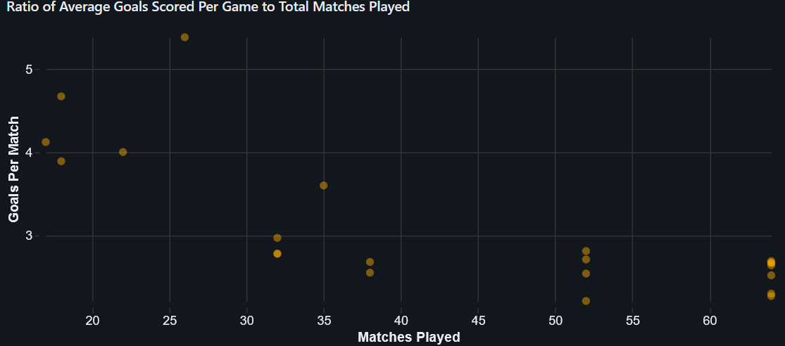
Ratio of Average Goals Scored Per Game to Total Matches Played
The scatter plot comparing goals per match to the number of matches in each tournament reveals how scoring trends relate to tournament size. Earlier tournaments, with fewer matches, tend to show higher variability in goals per match, including some of the highest scoring averages. As the number of matches increases in later tournaments, the goals per match tend to stabilize at lower values. This suggests that as the competition expanded, defensive strategies improved and games became more balanced. The highest goals-per-match values are seen in early tournaments, while more recent tournaments cluster around lower, more consistent scoring rates.
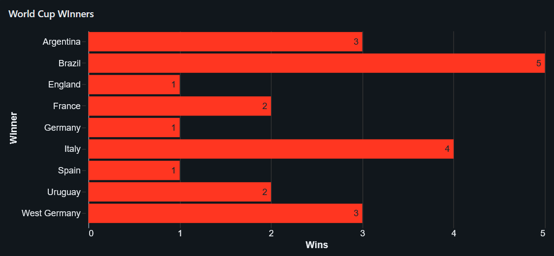
World Cup Winners
The championships bar chart highlights the distribution of World Cup victories among nations. Brazil leads with five titles, establishing itself as the most successful team in tournament history. Germany and Italy follow closely with four titles each, while countries such as Argentina with three wins, and France and Uruguay with two wins each.
The chart shows that success is concentrated among a small group of nations, particularly from Europe and South America. This suggests long-term dominance driven by strong football traditions, development systems, and consistent performance across decades. Lower values for other countries indicate that winning the World Cup is highly competitive and difficult to achieve.
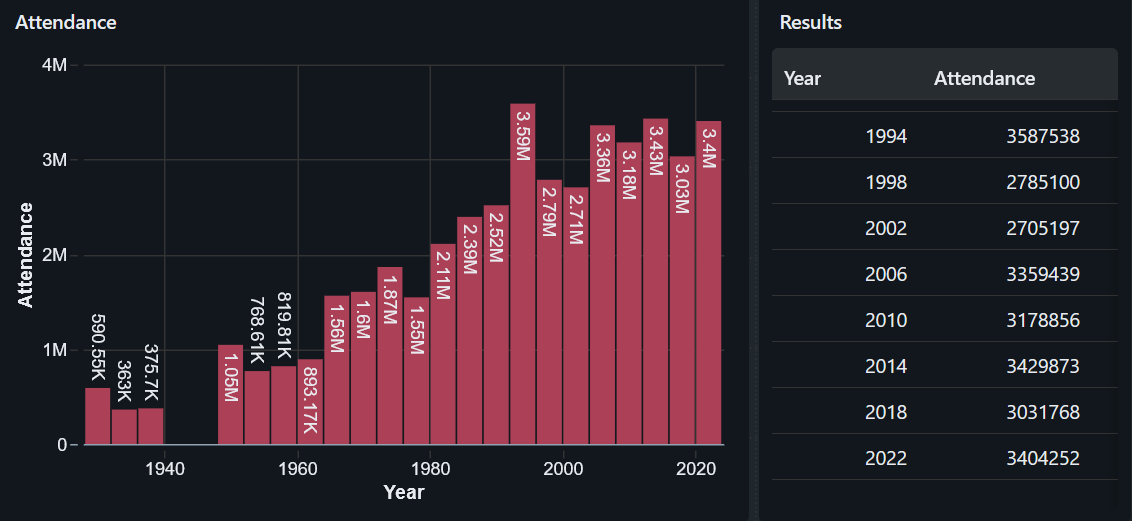
Attendance Over Time
The attendance visualization demonstrates how fan engagement has changed throughout World Cup history. In the early years, attendance figures are relatively low, reflecting limited global reach and infrastructure. A significant gap appears in the 1940s, as no tournaments were held in 1942 or 1946 due to World War II. Following the war, attendance steadily rises, showing the sport’s recovery and expanding international interest. A major peak occurs in 1994, when the United States hosted the tournament, producing one of the highest attendance totals. In recent decades, attendance remains consistently high, indicating sustained global popularity and improved stadium capacities. The lowest points are seen in the early tournaments and wartime period, while the highest occur in the modern era.
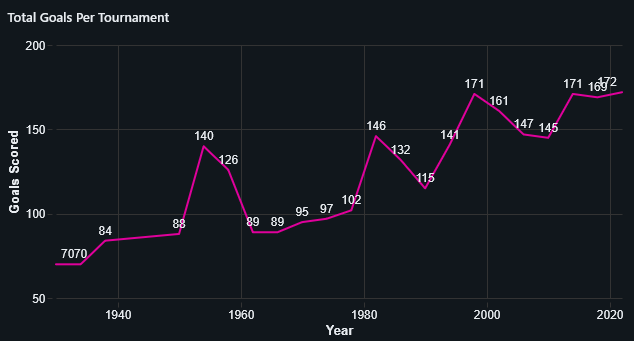
Total Goals per Tournament
The total goals line chart reflects the overall number of goals scored in each tournament. Unlike average goals per match, this metric generally increases over time due to the expansion of the tournament and the inclusion of more teams and matches. There are noticeable fluctuations, with some dips corresponding to periods of lower scoring efficiency. However, the overall trend is upward, with modern tournaments producing the highest total goal counts. The highest values occur in recent tournaments, while earlier tournaments naturally have lower totals due to fewer matches being played.
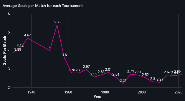
Average Goals per Match for each Tournament
The line graph of average goals per match shows a clear decline from the early years of the World Cup to the modern era. Early tournaments feature high-scoring games, indicating a more offensive and less structured style of play. Over time, the average decreases as tactics become more sophisticated and defensive organization improves.
A notable dip occurs around 2010, which can be partially attributed to the use of the Jabulani ball, often criticized for making scoring more difficult due to its unpredictable movement. In recent tournaments, the average begins to rise slightly again, suggesting a shift back toward more attacking play. The highest averages occur in the early to mid-20th century, while the lowest appear in the late 2000s to early 2010s.
Conclusions
Several key conclusions can be drawn from the dashboard. The steady rise in attendance is largely driven by factors such as globalization, improved transportation, larger and more advanced stadiums, and increased media coverage, especially with the expansion of TV and digital broadcasting. Major host countries with strong infrastructure, such as the United States in 1994, also contributed to unusually high attendance figures. In contrast, the absence of tournaments in the 1940s is directly linked to World War II, which halted international competition entirely.
In terms of performance, a small group of nations continue to dominate due to long-established football systems, strong youth development programs, and consistent investment in the sport.
Scoring trends show that earlier tournaments had higher goals per match because of less structured tactics and weaker defensive organization, while modern declines reflect more advanced strategies and highly trained athletes. Specific drops, such as around 2010, may be influenced by external factors like the Jabulani ball, which affected shot accuracy and control.
At the same time, total goals per tournament have increased due to the expansion of the competition, with more teams and matches naturally leading to higher overall scoring despite lower averages per game.